
What does a small business actually learn when its data is properly analysed?
A worked example using real transaction data from a coffee shop - showing the kinds of questions a dashboard answers, and what becomes possible when the answers are clear.
The starting point
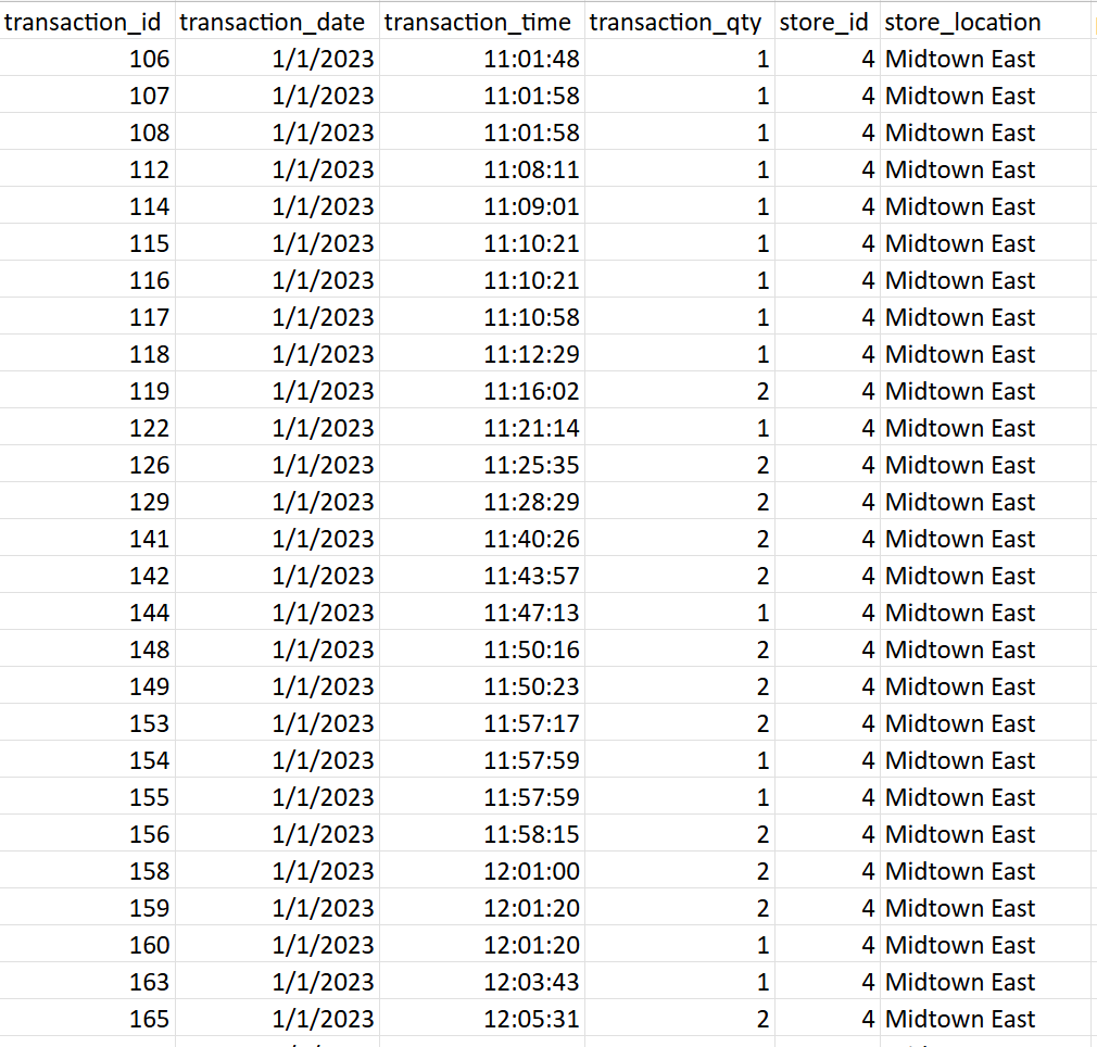
This example uses a transaction dataset from a coffee shop with multiple locations - the kind of data that exists in most businesses already. Dates, products, quantities, prices, store locations. Complete, but completely unreadable in its raw form.
Getting any meaningful answer out of it required manual filtering, ad-hoc formulas, and repeated effort. There was no single view of performance. No consistent definitions. No way to compare locations, products, or time periods without building something from scratch each time.
What became visible
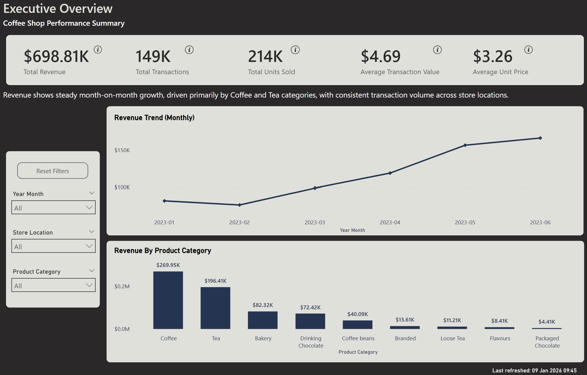
Once the data was structured and modelled, a three-page interactive dashboard surfaced answers to questions the business had been guessing at.
Which products actually drive revenue?
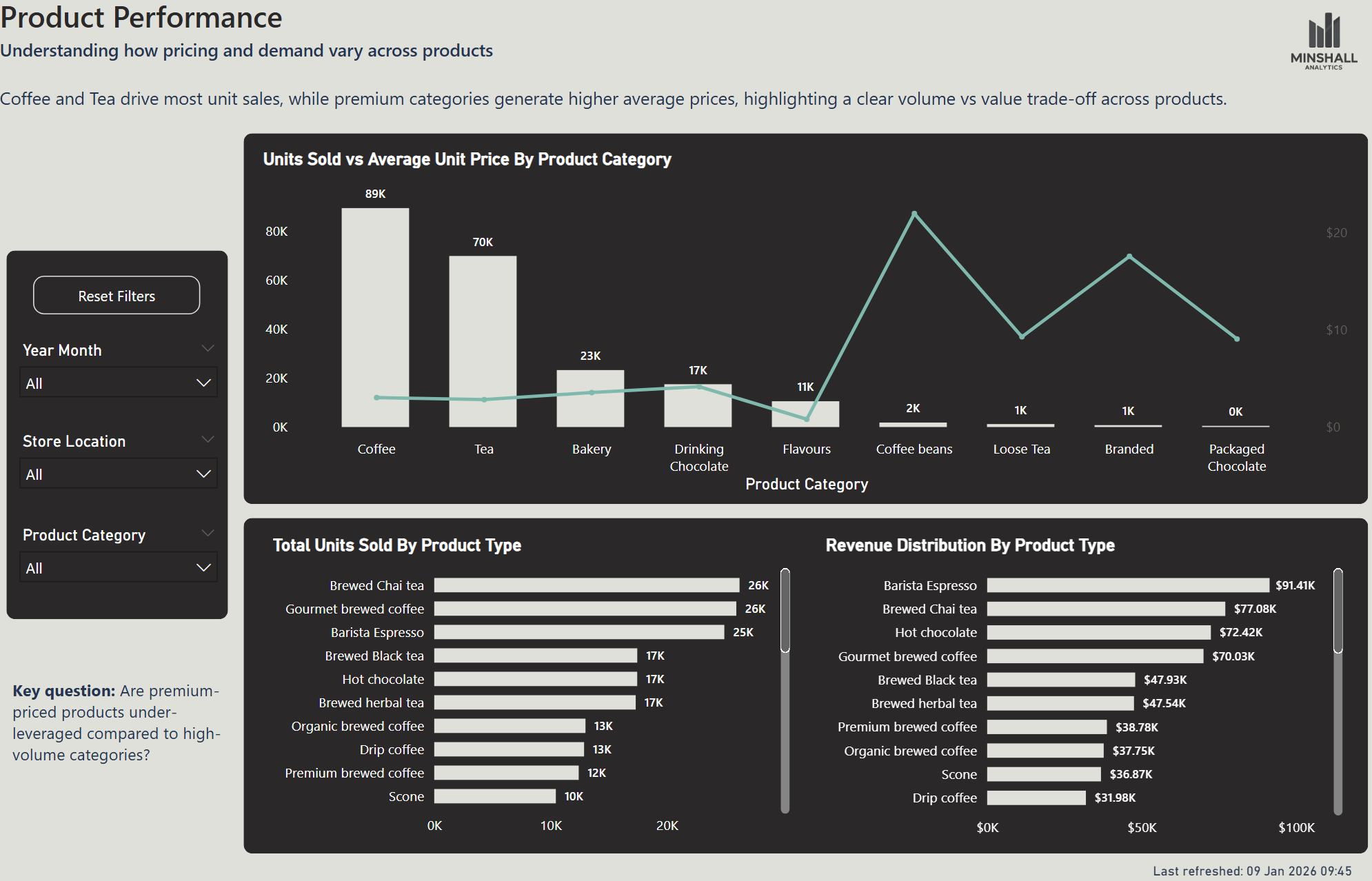
Coffee and tea account for the majority of revenue - but coffee beans have by far the highest average unit price. A business that knows this can make a deliberate decision about whether to push higher-margin products harder.
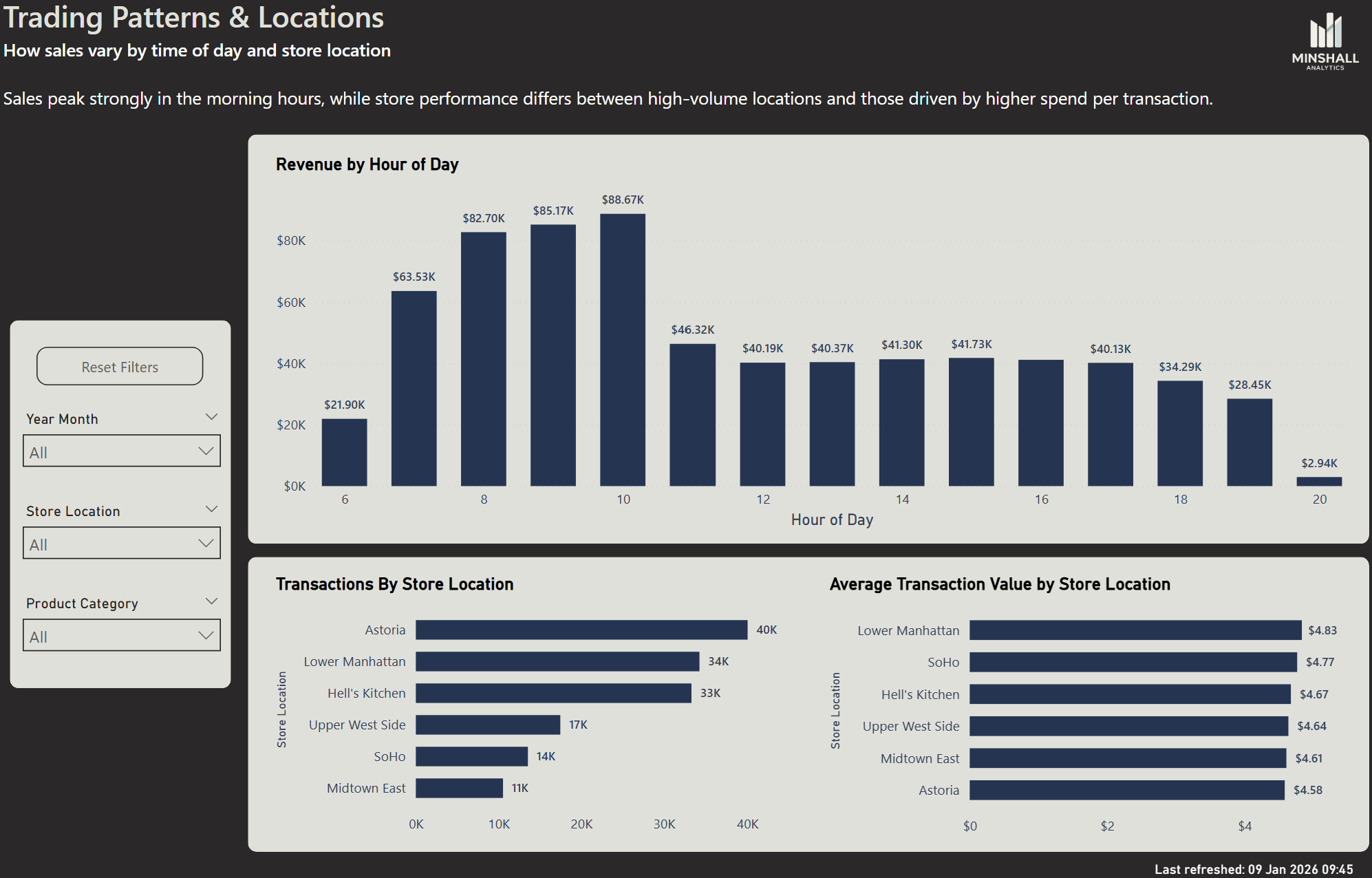
When is the business actually busiest?
The peak trading hour isn't the one most people would guess. Knowing the real pattern has direct implications for staffing, stock, and where management attention should be focused during the day.
Are all locations performing equally?
One location significantly outperforms the other on revenue. The dashboard shows not just the gap, but the average transaction value by store - which starts to explain why the gap exists and what might be done about it.
How the dashboard is structured
The dashboard is built across three pages, each designed to answer a different level of question - from overall performance down to the operational detail that explains it.
Executive Overview - the full picture, in seconds
Before this view existed, understanding how revenue was trending meant digging through transaction records, building pivot tables, and hoping the numbers added up. Which products were driving performance was anyone's guess.
This page replaces that process entirely. The most important KPIs are visible the moment you open it — revenue, transactions, average spend. A trend line shows how performance is moving over time. A category breakdown shows exactly which products are carrying the business and which aren't pulling their weight.
No filtering. No formulas. No interpretation required. Just a clear answer to the question every business owner asks on a Monday morning: how did we do, and what's driving it?
Product Performance - what’s actually driving your numbers
Knowing your total revenue is useful. Knowing what's generating it is what changes decisions.
This page goes beyond the headline numbers to show which products are earning their place and which are being overlooked. Volume tells one story. Price tells another. A product that sells in high quantities isn't necessarily your most valuable one - and a product that sells quietly in the background might be your highest-margin item by a significant margin.
In this dataset, coffee beans sell at roughly ten times the average unit price of other products. That's not obvious from a transaction report. But once it's visible, the question becomes immediate: is enough effort going into selling them?
That's the kind of question this page is designed to surface - not just what happened, but what you should probably do about it.
Trading Patterns & Locations - when and where your business actually performs
Staffing decisions are often made on assumption. Open early, cover the morning rush, scale back in the afternoon. It feels right - but without data, it's guesswork with a wage bill attached.
This page shows when revenue actually happens, hour by hour across the trading day. The peak isn't always where you'd expect it. In this dataset, the early morning hours before 8am are significantly quieter than the mid-morning period - which has direct implications for how many staff you need, and when.
It also compares location performance side by side. Not just transaction volume, but average spend per visit - which starts to explain not just which location performs better, but why. In this example, one location significantly outperforms the other. That gap doesn't show up in a till report. But once it's visible, it becomes a question worth asking: what's different, and can it be replicated?
Operational decisions - staffing, location investment, trading hours - shouldn't be made on instinct alone. This page gives you something more reliable to work from.
What this looks like for your business
The questions this dashboard answers aren't unique to a coffee shop. Every small business has a version of them - which products are worth pushing, when to staff up, which part of the operation is underperforming and why.
The difference is whether those questions get answered by instinct or by data. A well-built dashboard doesn't replace the owner's judgement - it gives that judgement something reliable to work from.
If you're curious what that would look like for your business, get in touch. A short conversation is usually enough to work out whether there's something useful here.